HomeSafe
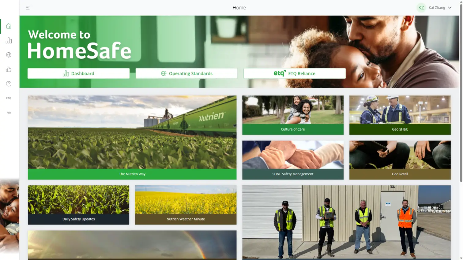
An employee facing site keeping track of safety metrics and working standards.
Timeline
Feb 2023 – Jun 2023
ORG
Nutrien
Role
UX/UI Designer
Designers
Kai Zhang
Sean Harley
Introduction
This work is part of Nutrien’s HomeSafe project where I worked in an end to end team to further enhance the product.
“Everyone Home Safe, Every Day.”
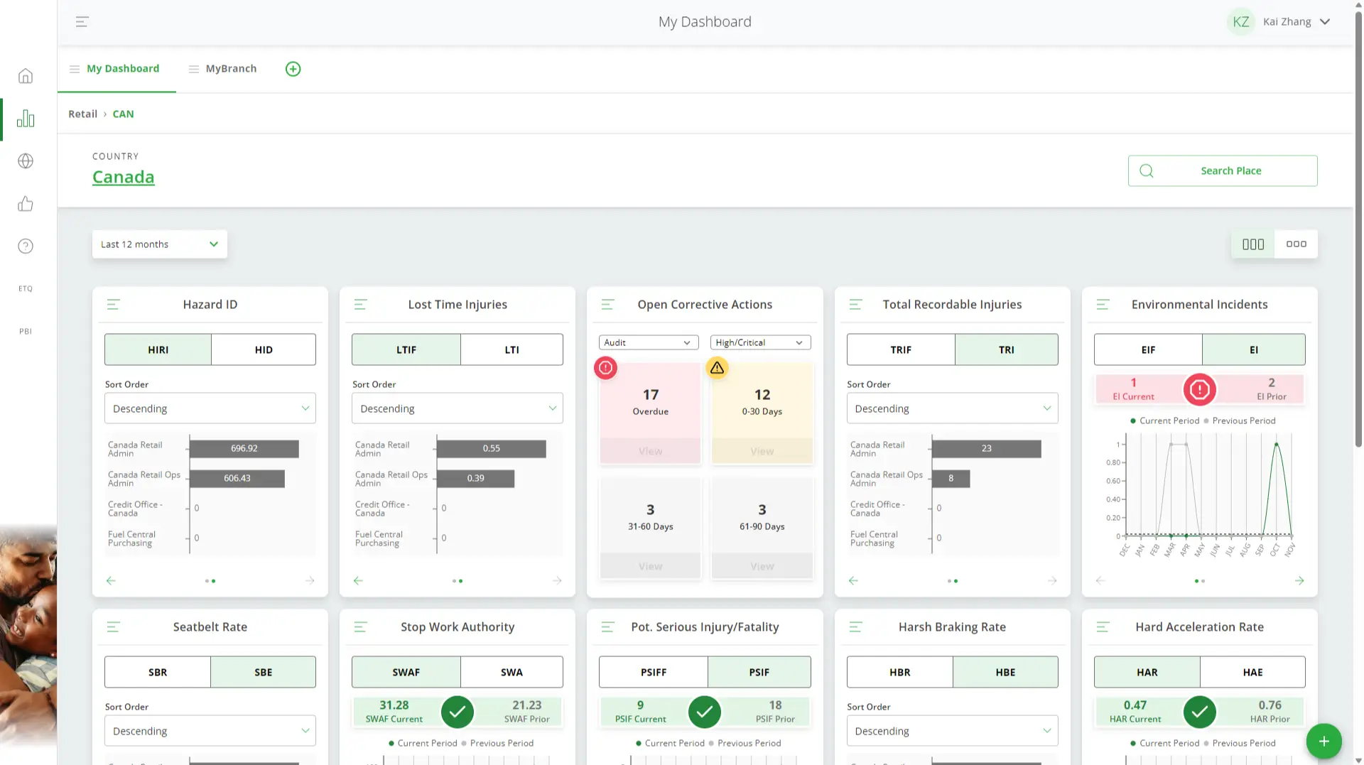
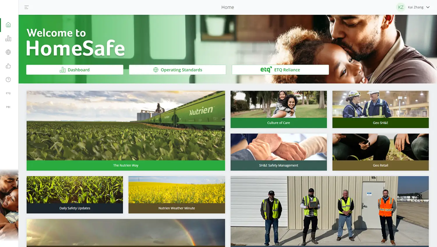
HomeSafe is a centralized safety metric data portal for Internal employees.
It serves as a single landing point to view safety, health, and environment activities, providing site-specific safety metrics in a quick and easy format.
Problem
“We need a streamlined way to upload a document form and link it to an associated operating standard”
Operating standards are forms that are required to be completed and kept for audit for compliance and record-keeping purposes. The initial requirements were to eliminate the current manual scanning and unstructured storage of these documents.
Goal
Digitize and centralize the management of signed Operating Standards forms at the branch level.
The practice at this point is still filling out paper forms and scanning them into the computer, once the file is in the computer, it can be kept any where by the user. We want to keep documents out of Onedrive/Email/Desktops/File Cabinets and in a central secure location.
Results
42% Increase in Active Users
60% increase in User Engagement
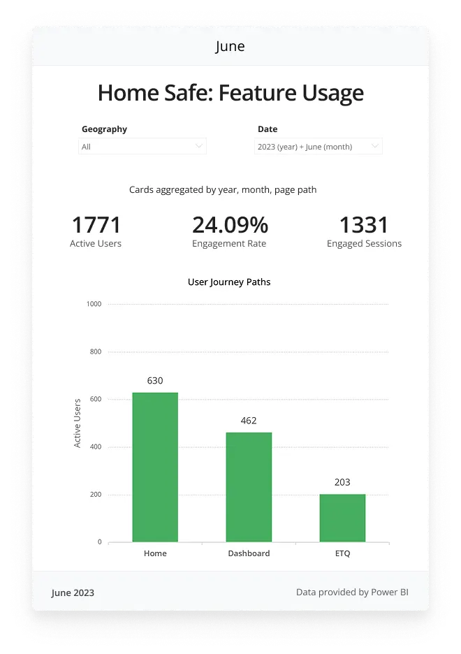
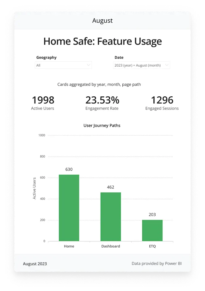
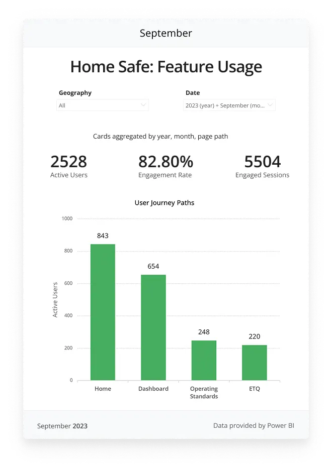
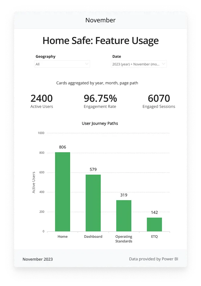
The release of the Operating Standards feature in HomeSafe marked a pivotal moment in user engagement, demonstrating the success of design improvements that addressed critical usability challenges. Post-launch data from September to November shows a 42% increase in active users (from 1,771 in June to 2,400 in November), underscoring the feature’s impact on adoption.
Design Exploration
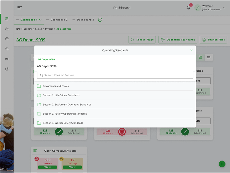
The initial designs were built on top of the existing operating standards model.
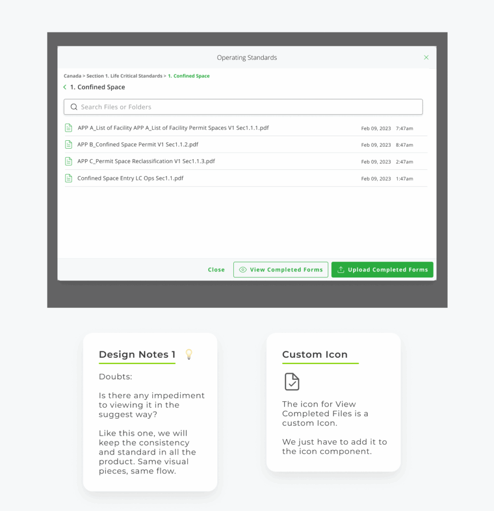
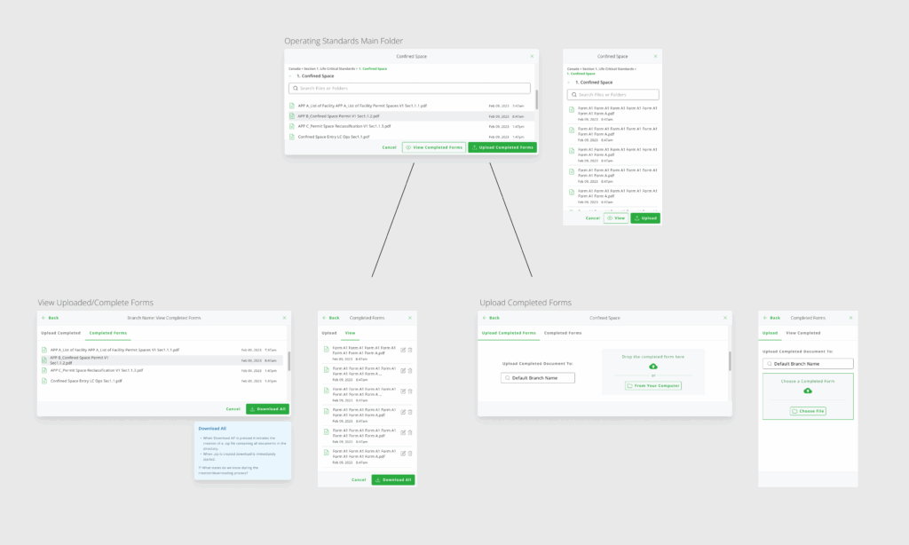
When the user selects “upload completed forms” a model will pop up to allow them to select a file, then upload that file to their default branch’s SharePoint.
The user would also have the option the option to switch over to the other tab to view all the uploaded forms for that branch’s SharePoint folder.
Problem
While designing out the modal various usability issues crept up
The bottom navigation button were confusing to understand for users
Users would need to first navigate to the deepest level folder, only then would the upload and view button will be shown, this lead to confusion with users
The upload modal opened on top of the existing modal, which isn’t ideal. We explored different options of displaying upload and view document screens, we tried using tabs or a carousel to shift between screens, but in testing users were more confused with navigation using these options than with a modal on top of a modal.
Pivoting to a Full Page
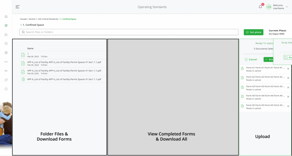
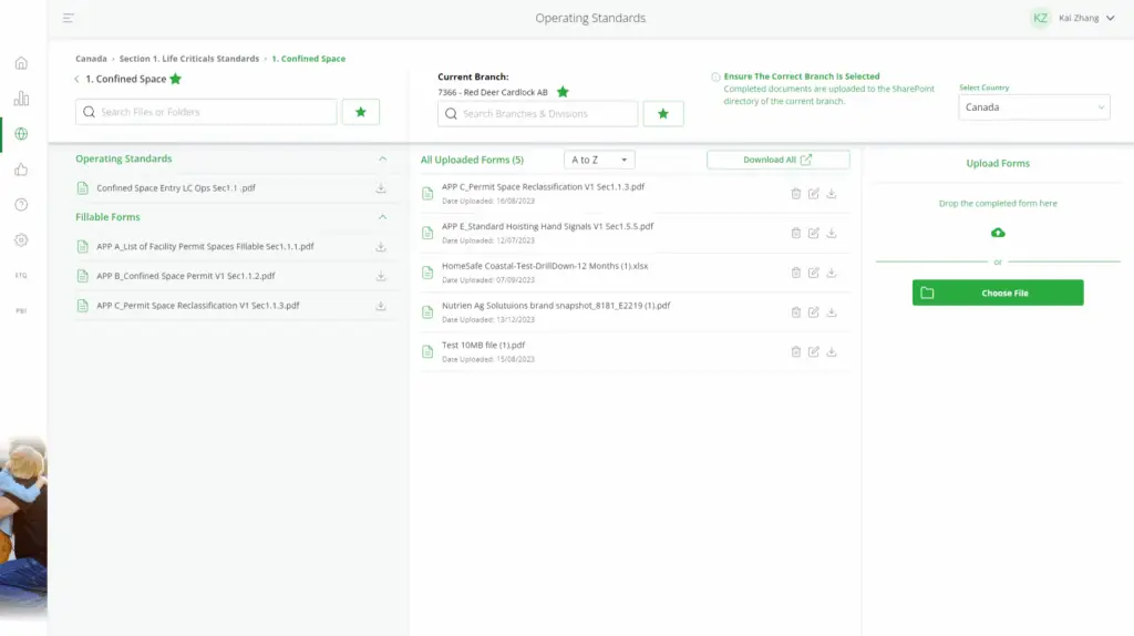
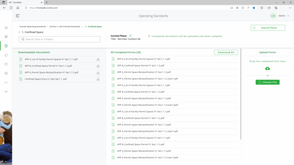
Below the bar, the user can view and download the Operating Standard files on the left, the middle panel is for viewing uploaded files associated with the set folder path on the left. The uploader is on the right, redesigned for a small width.
Concept Pitch
While presenting the final modal design to the PO, the topic of usability vs scope were brought up. Us designers were unhappy with more scope added to an existing already limited modal interface at the cost of usability while the owner did not want this project to drag on.
eventually we were allowed to explore different concepts for this projects, we wanted to make operating standards it’s own page instead of a modal, this way we can incorporate all the features while giving space to good usability.
We were given a week to explore the concept and present it in the next design meeting.
Iteration
We began exploring with wireframes, my initial idea was using pop-out drawers that can open and close to show uploaded files and the uploader.
We found that this didn’t utilize all the space available, so we experimented with having all 3 sections on the screen, this allowed users to more easily find the function they needed.
We received positive feed back from the team with this concept and continued on with this.
Pitch
After a design meeting with the PO we got the thumbs up to continue with this concept. During this meeting we were able to get our design questions answered and discussed the potential scope of this project, we were given a sprint to build and design out the rest of the functions.
Development
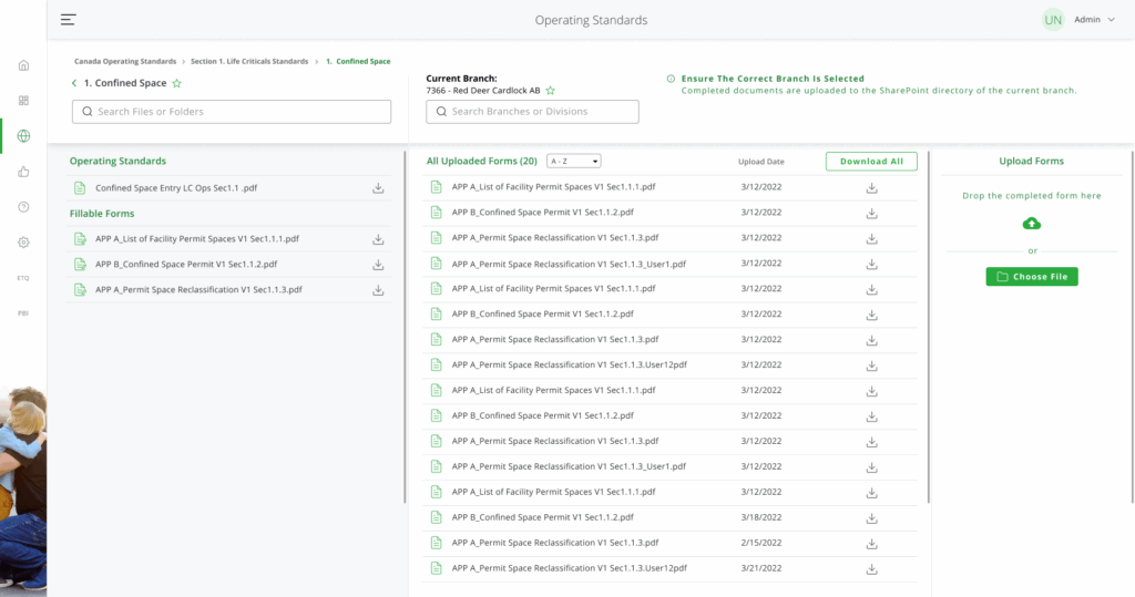
Refinement
In the 2 weeks we got, we were able to meet with the devs to to figure out the any design limitations and functionalities of the page.
We also incorporated feedback to every step of the design process from other designers, Product Owner and users.
Numerous changes were made based on the feedback we got:
• We separated fill-able forms and standards
• We added sorting and date to completed forms
• We moved branch changing out of the modal
• Favoriting is now in a drawer on it’s own
